Skip to content

#TuesdayTutorial: Progress Reports for Clients and Stakeholders

#TuesdayTutorial: Progress Reports for Clients and Stakeholders published on

This week you are writing an internal progress report. It’s similar to the kind of progress report that you might give to your manager or co-workers to let them know what’s happening with a project.

You also need to know about how to write external progress reports, which will go to clients or stakeholders outside your organization. While the general purpose is the same as that for an internal progess report, the audience is quite different.

The Lynda.com video Using in-progress reports to communicate with clients (4m 23s) will walk you through the key features and the important characteristics of this kind of progress report.
Screenshot from #TuesdayTutorial: Progress Reports for Clients and Stakeholders


Making Progress on Your Genre Analysis Report

Making Progress on Your Genre Analysis Report published on

This is the post for the week of July 17, 2017.

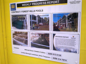
Progress Report by Forest Hill Society on Flickr, used under a CC-BY licenseThanks for your patience last week while I was at the Council of Writing Program Administrators Conference in Knoxville. I caught up on all the missing posts Saturday afternoon. If the info in those posts makes you want to change your proposal significantly, please use the Grace Period to give yourself a little extra time.
This week you will move on to writing your Genre Analysis Report, which is due by 11:59PM on Tuesday, August 8, 2017. After your work this week, you will write a Progrress Report that tells me about your project. Your Progress Report is due by 11:59PM on Monday, July 31.

Readings for This Week

Tasks for This Week

  1. By 11:59 PM on Monday, July 24, submit your Short Report Proposal in Canvas. The grace period ends at 11:59 PM on Thursday, July 27.
  2. Make 2 replies in the Discussing Example Genre Analysis Reports, following the instructions that you find in the post. Your responses are due Friday, July 28 by 11:59 PM. Grace period ends at 11:59 PM on Monday, July 31.
  3. Share a draft of your Progress Report in the Feedback on Progress Reports on Canvas by 11:59 PM on Friday, July 28.
    • In your message, ask your group to look at anything you are trying to improve. Let them know the kind of advice you need.
    • By noon on Monday, July 24, provide feedback to your group members, using the strategies in the Peer Review Commenting Strategies video.
    • Post your Progress Report in Canvas by 11:59PM on Monday, July 31. The grace period ends at 11:59PM on Thursday, August 3.
  4. By 11:59PM on Friday, July 28, write your 07/28 Labor Log in Canvas. Specific questions for your log are included in Canvas. The grace period for your log entry ends at 11:59 PM on Monday, July 31.


Photo Credit: Progress Report by Forest Hill Society on Flickr, used under a CC-BY license.


#WeekendWatch: Comma Splices

#WeekendWatch: Comma Splices published on

At one point or another, you are bound to make a comma splice. We all have. I make them most often when I’m texting and not paying attention to what I’m doing. It’s not the worst error you could make, but it is one you should avoid in professional writing.

So you know comma splices are a problem to avoid, but do you know what they are? Watch this tutorial video from Texas A&M to find out!


#FridayFact: Five Presentation Mistakes

#FridayFact: Five Presentation Mistakes published on

Powerpoint by Bart Everson on Flickr, used under a CC-BY licenseThe #FridayFact for this week is one that I’m sure everyone agrees with: no one likes a boring slideshow with crowdedl text on the slides. The Harvard Business Review article Five Presentation Mistakes Everyone Makes, by Nancy Duarte, outlines these errors:
  1. Failing to engage emotionally.
  2. Asking too much of your slides.
  3. Trotting out tired visuals.
  4. Speaking in jargon.
  5. Going over your allotted time.

The article is short and easy to read, so take a few minutes to learn how you can improve the presentations you give!


Photo credit: Powerpoint by Bart Everson on Flickr, used under a CC-BY license.


#InfographicInspiration: Put CRAP in Your Document Design

#InfographicInspiration: Put CRAP in Your Document Design published on

Lynda.com Login Help

Lynda.com videos are free to Virginia Tech students with your VT.EDU login. Start at the VT.EDU login page to access these resources.

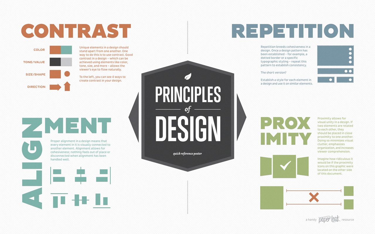
One of my favorite ways to talk about strong document design is the CRAP method. That stands for Contrast, Repetition, Alignment, and Proximity. Using all four of these elements helps give your work a polished appearance and catches readers’ attention.

This week’s #InfographicInspiration gives you a quick overview of all four elements. It is worth saving for future use.

For a more detailed explanation of the elements, watch the Lynda.com video, Understanding the PARC system (Lynda.com was apparently afraid to say CRAP, so they spell it backwards).

CRAP Principles of Design


#WednesdayWorkshop: What to Include in Your Proposal

#WednesdayWorkshop: What to Include in Your Proposal published on

Lynda.com Login Help

Lynda.com videos are free to Virginia Tech students with your VT.EDU login. Start at the VT.EDU login page to access these resources.

Better late than never, right? For your #WednesdayWorkshop, I wanted to recommend a series of videos on Lynda.com that goes over the different parts that go into a proposal. Altogether, the videos will take 28m53s of your time. The videos includes all of the following:

  • Overview of proposal parts (4m40s)
  • Prefatory parts (5m28s)
  • Body parts (5m7s)
  • Ending parts (4m31s)
  • Appended parts (4m22s)
  • Visuals (4m45s)

Log in to see the video. A preview is below:


Writing a Proposal
by Judy Steiner-Williams


#TuesdayTutorial: Designing for Readers

#TuesdayTutorial: Designing for Readers published on

Lynda.com Login Help

Lynda.com videos are free to Virginia Tech students with your VT.EDU login. Start at the VT.EDU login page to access these resources.

As you work on your proposal this week, you need to spend time focusing on the document design to make sure that your proposal is reader-friendly. Writing in the workplace needs not only to have great content, but also a layout and design elements that help the reader find all the important information in the document.

This week’s #TuesdayTutorial is a short video from Lynda.com: Constructing a Reader-Friendly Design (3m6s). The video demonstrates how to use headings and layout to break up your text, making it easy for readers to find the information they are looking for. As you think about breaking up and organizing your text with the ideas in this video, be sure to keep in mind the tips for
Creating Information-Rich Signposts.

Screenshot of Lynda.com video

This video is part of a course on writing proposals, and I will share some other sections from the course later this week. If you have time to watch the entire course, it will help you as you write your proposal.


Proposing Your Project

Proposing Your Project published on

This is the post for the week of July 17, 2017.

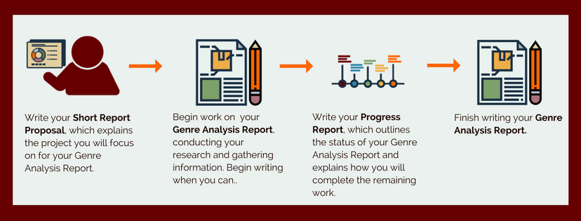
This week, you will write your Short Report Proposal, which explains what you want to focus and how you will conduct your research and writing for your Genre Analysis Report. All of the remaining major projects in the course are connected. Here’s how:

The take-away message is that you have to decide on your plan for both the proposal and the genre analysis report this week.

Logistics Note for This Week

I leave Tuesday for the Council of Writing Program Administrators Conference in Knoxville. I will drive back on Sunday. I will have internet access and check in often (except while driving, of course), but there may be minor delays in my responses to your questions and in my daily posts on the course website.

Readings for This Week

Tasks for This Week

  1. By 11:59 PM on Monday, July 17, submit your Analysis of Writing Project in Canvas. The grace period ends at 11:59 PM on Thursday, July 20.
  2. Review the assignments for the Short Report Proposal and Genre Analysis Report. The Examples, Cases & Models: Proposal provides some models you can use as you works. Post any questions you have about the assignments in #general on Slack.
  3. Share a draft of your Short Report Proposal  in the Feedback on Short Proposals on Canvas by 11:59 PM on Friday, July 21.
    • In your message, ask your group to look at anything you are trying to improve. Let them know the kind of advice you need.
    • By noon on Monday, July 24, provide feedback to your group members, using the strategies in the Peer Review Commenting Strategies video.
    • Your Analysis of Writing project is due Monday, July 24 at 11:59PM. The grace period ends at 11:59PM on Thursday, July 27.
  4. By 11:59PM on Friday, July 21, write your 07/21 Labor Log in Canvas. Specific questions for your log are included in Canvas. The grace period for your log entry ends at 11:59 PM on Monday, July 24.


#WeekendWatch: Create Information-Rich Signposts

#WeekendWatch: Create Information-Rich Signposts published on

Lynda.com Login Help

Lynda.com videos are free to Virginia Tech students with your VT.EDU login. Start at the VT.EDU login page to access these resources.

Next week, you will begin working on your short proposals and thinking about your genre analysis reports. Both of these documents (and many other things that you write) will benefit from the document features that you include.

This week’s #WeekendWatch video discusses how including clear headings, subheadings, and links helps readers navigate your document by providing information-rich signposts. Listen for a reference in the video to the F-shaped reading pattern, which these document features support.

The video refers to online documents specifically, but most of these features are useful in printed documents as well. Obviously links are not very helpful in printed work. Headings and subheadings certainly are.

Learning to Write for the Web by Chris Nodder (video, 5m22s)

After you watch the video, you can discuss the ideas in the #WeekendWatch Discussion in Canvas.


#FridayFact: F-Shaped Reading Pattern

#FridayFact: F-Shaped Reading Pattern published on

Eye-tracking studies show that people read online documents in an F-shaped pattern, shown here:

Heatmaps Showing F-Shaped Reading Pattern

They scan across the top of the page and then down the left side of the page until they find another significant word or phrase that catches their attention. At that point, they scan across the page a bit and then resume scanning down the page a bit. People rarely read everything on the page. They scan and decide in a matter of seconds what action to take next. They may never scroll down the page.

If you are writing documents that people will read online—whether email messages, attached files, or webpages—you need to use document design elements that will put your most important information in the path of the F-shape pattern.

As you consider this study, think about the design strategies that would help readers find the significant information in your messages, and share your ideas in the #FridayFact Discussion in Canvas.

Read more


Photo Credit: Jakob Nielsen’s F-Shaped Pattern For Reading Web Content


Primary Sidebar