Skip to content

#InfographicInspiration: Pitch Your Idea in 60 Seconds

#InfographicInspiration: Pitch Your Idea in 60 Seconds published on

Today’s #InfographicInspiration focuses on the 60-second challenge to share information about yourself, your company, or your idea. Even though they may not take place in an elevator, elevator pitches are an important capability for anyone in the workplace.

You never know when you may have a few seconds to pitch an idea to someone, so review the tips in today’s infographic and practice your pitch to make sure that you are always ready.

The Perfect Elevator Pitch


#InfographicInspiration: What Goes Into a Letter

#InfographicInspiration: What Goes Into a Letter published on

We’ve been spending time this week on correspondence, and I am continuing that trend with today’s #InfographicInspiration. From the website The Visual Communication Guy, our infographic provides an annotated explanation of what goes into a letter and how to format letters that you write. The information here reinforces and adds to the #TuesdayTutorial on formal letters.

Note that the image on this page is minimized. Click on it to see the enlarged (and more readable) version.

How To Format a Letter, from The Visual Communication Guy


#InfographicInspiration: Writing Email That Gets Read

#InfographicInspiration: Writing Email That Gets Read published on

Earlier this term, I shared a #FridayFact about email in the workplace. For our #infographicInspiration this week, I’m returning to email by sharing a simple image that identifies key characteristics of effective email messages.

The website’s name is a little off-color, but the information clearly and concisely outlines specific ways to improve your email messages. Read more information about the infographic in the article 10 tips for effective email.

Email That Works Infographic


#InfographicInspiration: Put CRAP in Your Document Design

#InfographicInspiration: Put CRAP in Your Document Design published on

Lynda.com Login Help

Lynda.com videos are free to Virginia Tech students with your VT.EDU login. Start at the VT.EDU login page to access these resources.

One of my favorite ways to talk about strong document design is the CRAP method. That stands for Contrast, Repetition, Alignment, and Proximity. Using all four of these elements helps give your work a polished appearance and catches readers’ attention.

This week’s #InfographicInspiration gives you a quick overview of all four elements. It is worth saving for future use.

For a more detailed explanation of the elements, watch the Lynda.com video, Understanding the PARC system (Lynda.com was apparently afraid to say CRAP, so they spell it backwards).

CRAP Principles of Design


#InfographicInspiration: Your Guide to Technial Writing

#InfographicInspiration: Your Guide to Technial Writing published on

Today’s infographic shares 5 tips that will help you do well in your technical writing projects and in the workplace. The information is clear and to the point (just as the first tip suggests). If you follow these tips, you will always have a very good project. Discuss the infographic in the #InfographicInspiration Discussion in Canvas. You can talk about whether you agree with the tips and share any tips you have learned from your work in the field or studies. And here’s a challenge: what words are misused in the infographic?

Your Guide to Technial Writing: 5 Tips to Get Started

from https://contentmart.com/blog/2017/07/03/technical-writing-guide/


#InfographicInspiration: Succeeding in this Course

#InfographicInspiration: Succeeding in this Course published on

How to Succeed in this Online ClassEvery Thursday, I will post an infographic that relates to the course. This week, I am sharing the infographic that I asked you to view in the Course Overview Module.

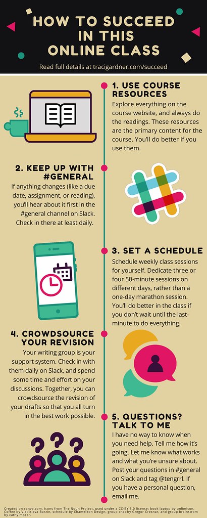
It is tempting with online courses to think that you can easily fit the work in each week. Many times though, I have had students write me to let me know that they underestimated the time needed for the course and weren’t sure that they would have their work finished by the end of the grace period.

Some planning now, at the beginning of the term, can help you avoid finding yourself in this situation. Follow the tips in this infographic and the expanded tips on the How to Succeed in this Online Class page to be sure you set yourself up for success.

Perhaps the most important piece of advice I can give you is to set a schedule for yourself while you’re taking the course. Your other classes, your job, and your social and professional obligations typically have set times that you can track in your calendar or planner. Be proactive and block out class time for this course several times a week as well. Treat your online course just like a face-to-face course by adding some 50-minute blocks to your schedule that you will dedicate to doing work for the course.

Online courses require the same time commitment as regular face-to-face classes. At Virginia Tech, courses are required to have 36.5 hours of class time. In addition, each course usually has about 3 hours of out-of-class work for each week in the regular semester. Summer school has a shortened term of only 5 weeks. That means that you expect about 7 hours of class time and 9 hours of out-of-class work for each week during summer session.

You may be thinking, “But hey, we don’t meet in class. How can we have 7 hours of class time during the week?” For this course, your class time is the time you spend doing readings and watching videos as well as the time you spend working with your writing group. The time you spend researching and writing your drafts is out-of-class work.

So in closing, I advise you to plan well so that you can avoid problems. Further, keep the other advice from the infographic and page in mind as you work. You will find that simple actions like checking in on Slack and letting me know whenever you have a question will also make a big difference.

And that’s this week’s #infographicinspiration. If you have a tip for succeeding in online classes, jump on Slack and share it in #general.


Primary Sidebar